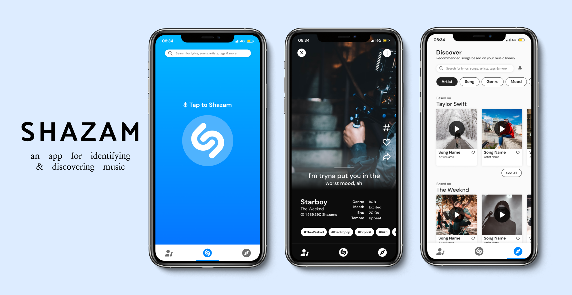
Project Overview
UX Team
Jenny Lam (me)
Stephanie Miller
Lesha Gajjar
My Role
User Research, Screener Survey, Persona, User Flow, Site Map, Comparative & Competitive Analysis, Sketches, Wireframe, Mid-Fidelity Prototype, High-Fidelity Prototype
Tools
Figma, ProCreate, Google Survey, Zoom, Otter
Platform
Mobile App
Duration
One Month
Note: This project was a conceptual educational exercise to practice UX skills and is not affiliated with Shazam
What is Shazam?
Shazam is an application that can identify music and TV shows by listening to a short sample of their audio. To use Shazam, simply tap the Shazam button in the app or activate it through Siri on an Apple device. Once a song or TV show is identified, Shazam displays additional information and sharing options.
The Challenge
-
Business Problem
Research indicates that the most common use case of Shazam lasts less than half a minute.
-
Business Goal
Increase the time users spend on Shazam by providing a new, engaging service.
The UX Process
-

Discover
-

Define
-

Design
-

Deliver
Discover
Discover |
Initial Research
To figure out the reasons behind the business problem, we had to understand what the current user experience was like. In order to tackle this, we began our research with a screener survey to find six users that met all three criteria below:
Listen to music frequently
Has added music to their playlist or music application of choice in the past month
Has previously used the Shazam app before
We analyzed the research data gathered from the interviews and found three key insights based on our affinity mapping
Research Insights:
“When Shazam can’t identify the song, I google the lyrics”
“Once I identify the song, I leave to go to another app to play the song or add it to my playlist”
“I want more unique recommendations for new songs from my music app”
Define
Problem Statement:
Users shared that they really wanted a way to easily find unique song recommendations that aren’t llimited by music genre because they feel like they are getting the same popular song recommended to them by other apps.
How Might We…
… make it easy for users to find unique new song recommendations based on patterns from songs that they have identified?
… give users recommendations to go across genres?
… find patterns in user’s music taste that will be helpful to them?
… give recommendations to users based on the moods of the songs they identify?
Define | Persona
With all the research information gathered, we developed a user persona - Ashley. Ashley represents the behaviors and pain points of Shazam’s target users.
Define | Competitive Analysis
To find out what was missing from the current app experience, we looked at popular music applications to see what features other apps had compared to the Shazam app. We specifically looked at Spotify, YouTube Music, and Amazon Music.
Define | Site Map
In the current navigation of the Shazam app, we found that some users didn’t know that there were other features on the app besides searching for songs. We decided that before moving onto our sketches, it would be a good idea to create a site map knowing that we would want to change the navigation of Shazam in our redesign so that users are well aware of the other features on the app aside from identifying music.
The three main buttons on the bottom navigation of the app are: My Library, Shazam, and Discover.
Define | User Flow
The below user flow demonstrates the different ways users can navigate through the app using the bottom navigation to find unique song recommendations.
Design
Design | Sketches
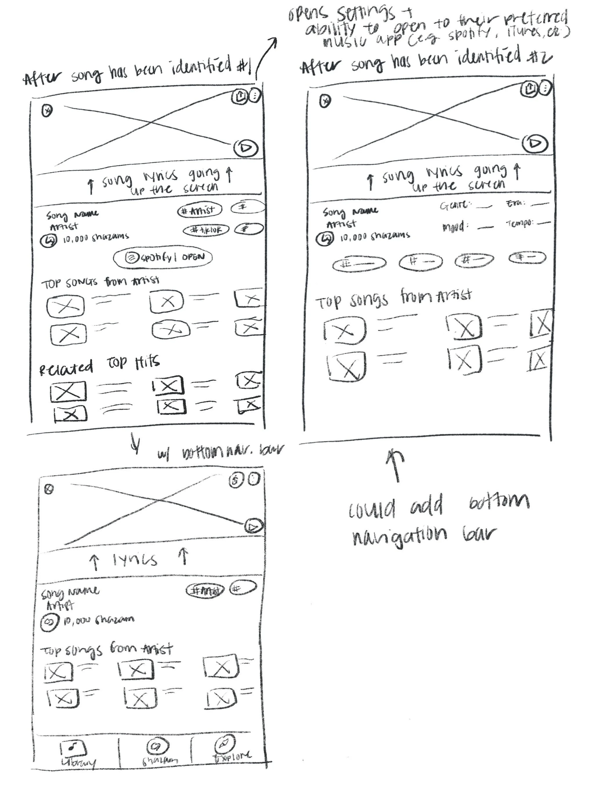
Using all the data we’ve gathered so far, my team and I each sketched multiple solutions to the main navigation screens that would ultimately help our users in easily discovering new music.
Below are my sketches of the main navigation screens, which includes:
home screen (shazam'ing a song) | tagged song | music library | explore
Design | Mid-Fidelity Wireframes
After we each finished our sketches, we came together to identify which screens we drew shared similar elements. From there, we designed our digital wireframes. The flows below demonstrate the different ways users can get unique song recommends.
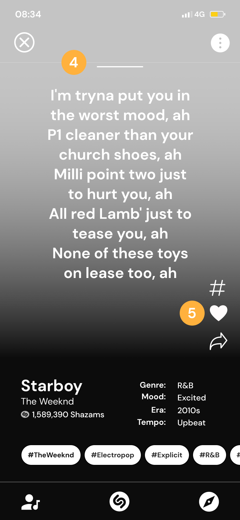
Tagging a Song
1. Users taps on the screen to Shazam a song
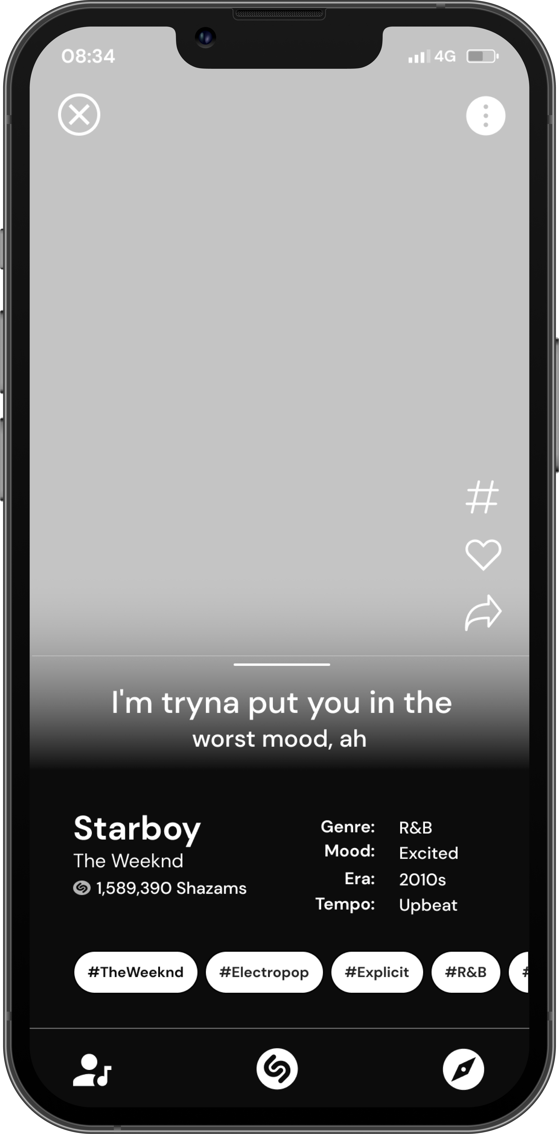
2. The tagged song is shown on the screen along with information about the song
3. The bar can be dragged upwards to view more lyrics
4. Lyrics are shown at full view. The bar can be pulled downwards to minimize lyrics screen
5. Users can “like” a song by tapping the heart icon
Creating Hashtags
1. Users can select the hashtag icon to add new tags to the song
2. Users can either select popular hashtags that are already associated with the song or type in their own
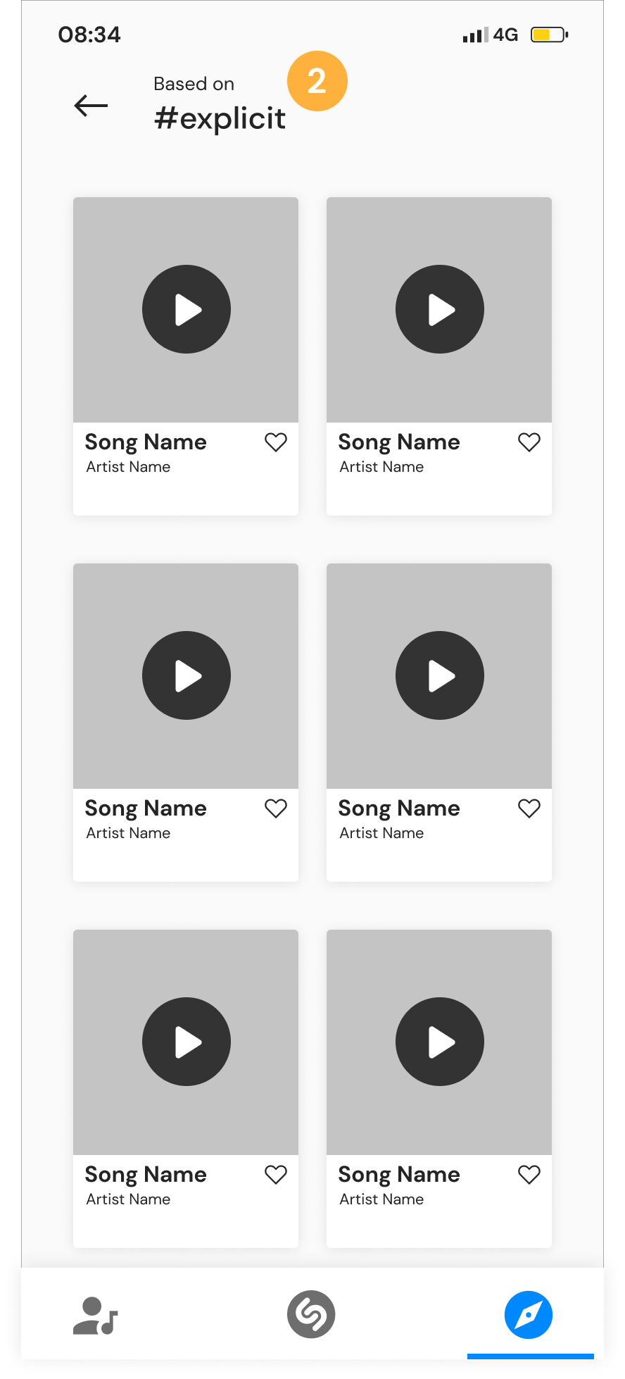
Viewing Hashtag
1. Users can also select to view a hashtag from the horizontal scroll
2. Users are shown all other recommended songs from the hashtag they selected
Swipe for Next Song
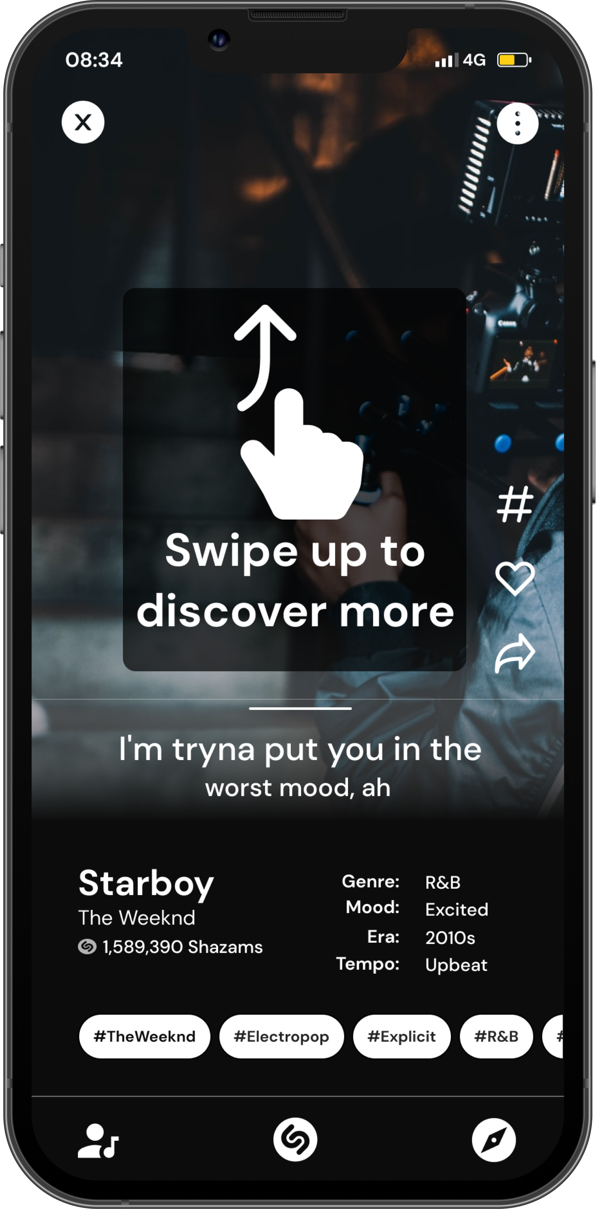
Users can swipe up from bottom to explore the next related song, similar to TikTok and Instagram Reels
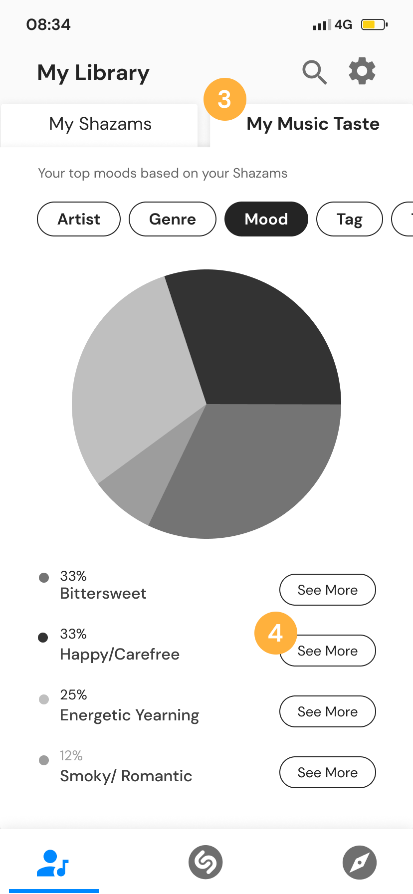
My Library Tab
1. Users can navigate to their “My Library” screen from the bottom navigation
2. Users can toggle to the “My Shazams” tab to view their past shazam’ed songs and and liked songs
3. Users can toggle to the “My Music Taste” tab to view a pie chart summary of songs that are based on their past shazams, separated by categories
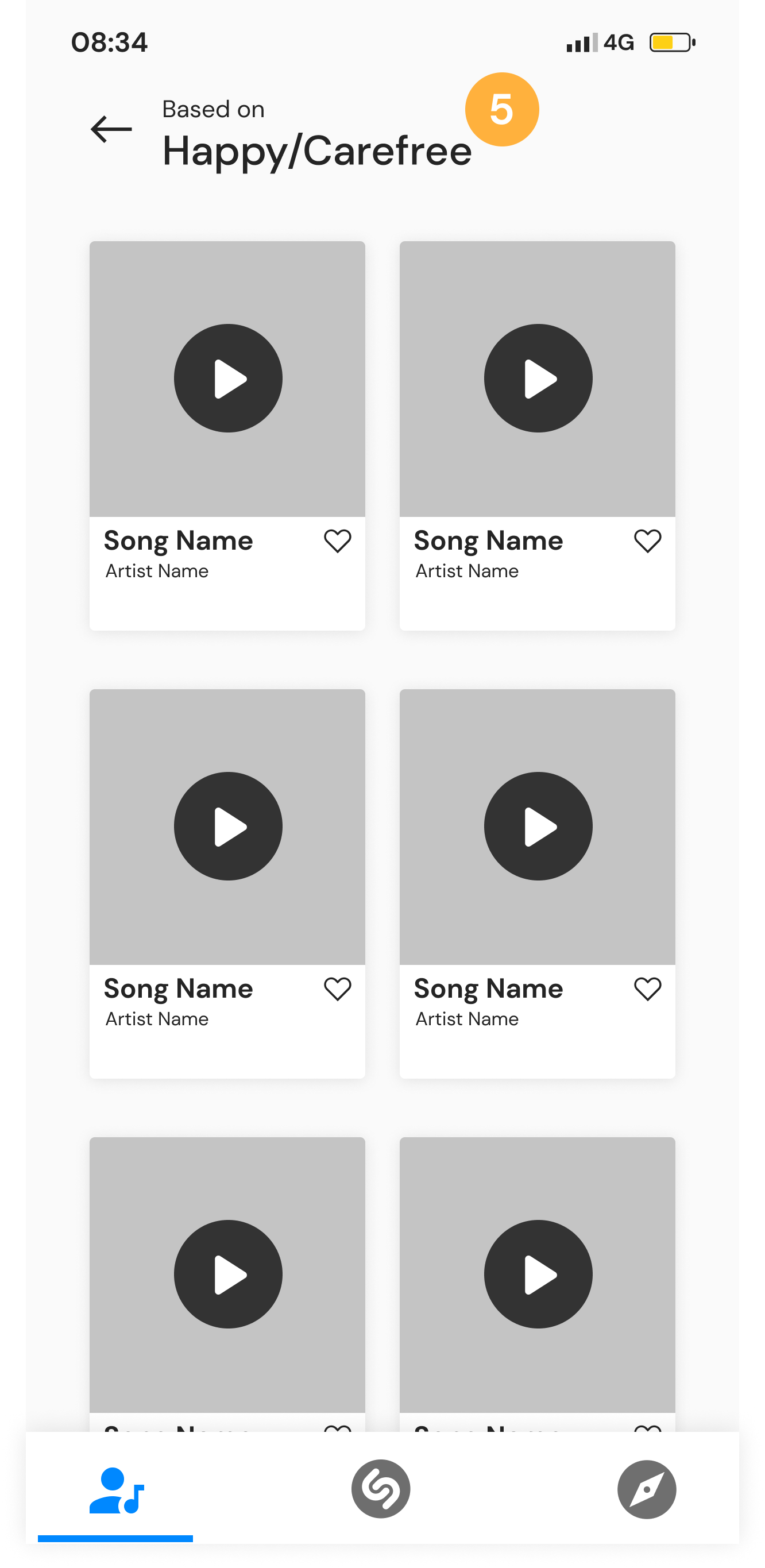
4. Users can select “see more” to view more song recommendations
5. Users are brought to a related songs page based on the selected category after clicking “see more” from the previous screen
Discover More Song
1. Users can select the explore tab from the bottom navigation to discover more songs
2. Users can toggle between the categories. Here, we’re selecting “Artist”
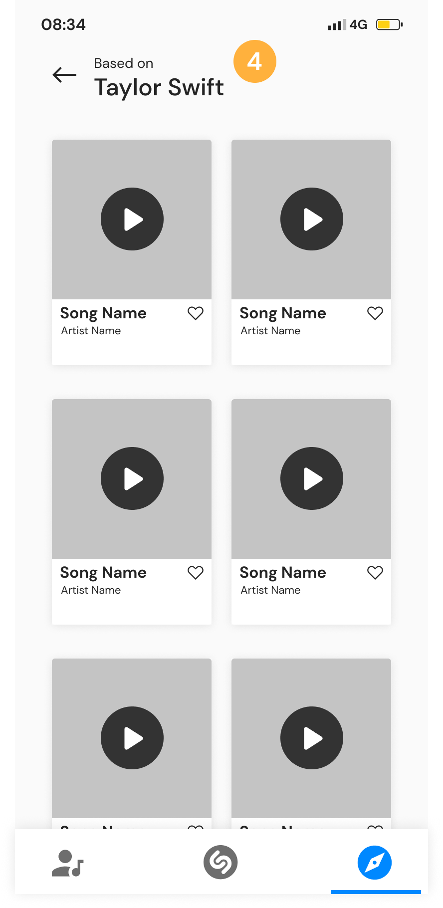
3. Users can select “See All” based on the category they’re browsing to view more related music
4. After selecting “See All” from the previous screen, users are able to explore more music. In this example, we are looking at more music “Based on Taylor Swift”. The play button allows users to listen to a snippet of the song while they’re exploring
Design | Usability Test #2
Our team conducted usability test on the mid-fidelity prototype with four users, each with 11 tasks to complete. Here are some of the results below.
Usability Test Results
4/4 users were able to add hashtags to a song they discovered
1/4 users successfully swiped up to find the next related song
4/4 users were able to find the “My Music Taste” tab and understood what the purpose of the page
Deliver
Deliver | Changes
Based on the feedbacks received from the mid-fidelity prototype, below are some of the changes that were made.
Deliver | Change #1
Added an onboarding process to let users know of the swipe up feature
Deliver | Change #2
2. Rephrased the language under “My Music Taste” tab to be more clear
Deliver | Change #3
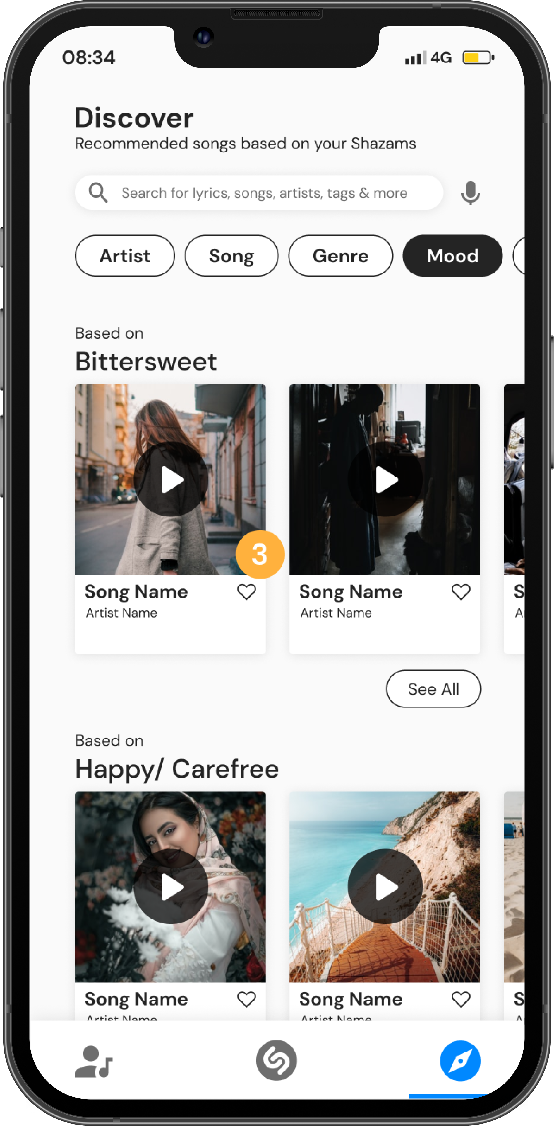
3. Added a quick “like” feature to the Discover tab
Define | High-Fidelity Prototype
Next Steps
From our usability testing results on the mid-fi prototype, we received feedback from the users on other features they would’ve liked to see on the app. Unfortunately, we did not get the chance to incorporate all features brought up as we wanted to focus on the most important features that would allow our users to have a seamless experience on the app.
For the next steps, I would consider adding or changing some of the features mentioned below:
Add a quick play button to the Discover page
Add a music bar that would be docked at the bottom of the app
Building out the kabob menu on the identified song screen
Change the colors on the pie chart under “My Music Taste” screen
Conduct round two of usability testing with all changes made
