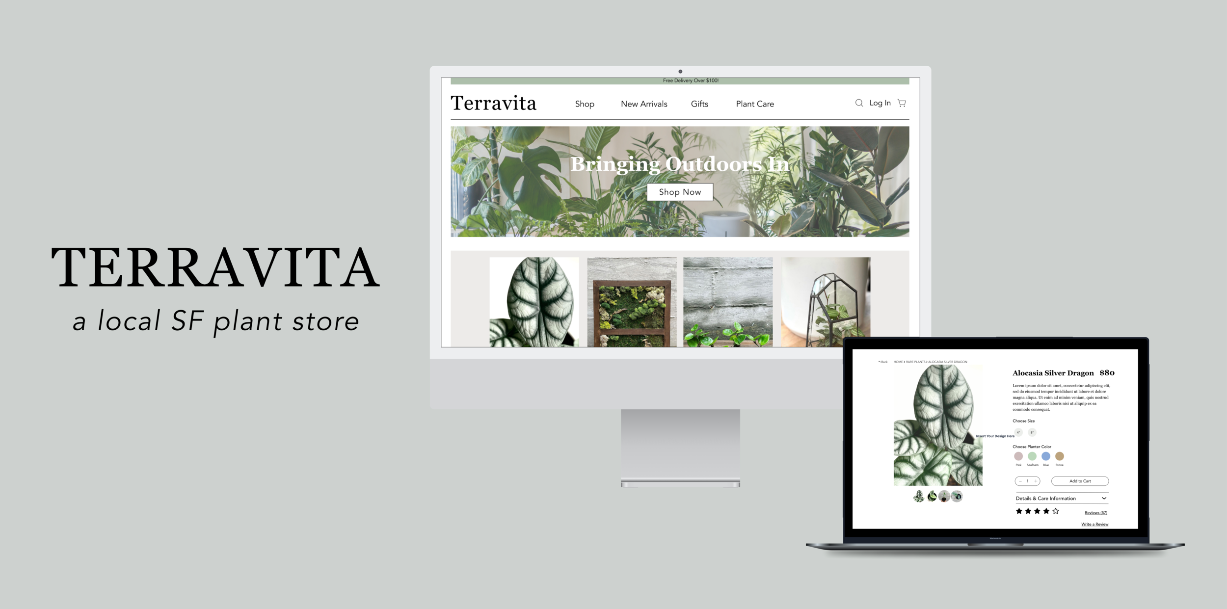
Redesigning the website of a local San Francisco plant store
Role: UX/UI Researcher & Designer || Timeline: 4 weeks
Note: this project was a conceptual educational excercise to practice UX skills and is not affiliated with Terravita plants.
About Terravita
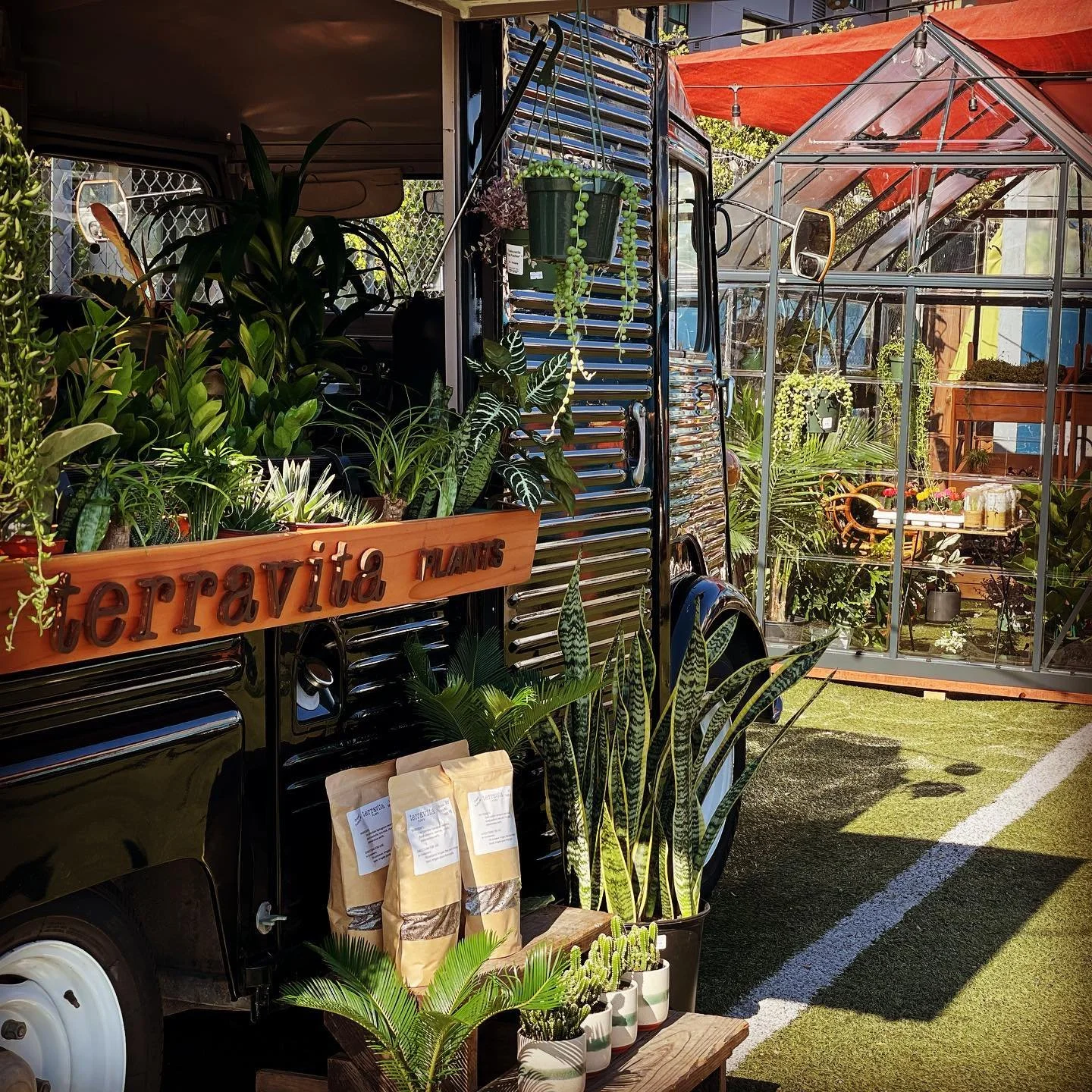
Terravita is a local mom and pop plant shop located in the Hayes Valley district of San Francisco.
Their first shop was located in the Mission district but fell victim to COVID closures. They have since reopened to a smaller spot in the heart of Hayes Valley next to Smitten’s Ice Cream.
The shop carries many different types of plants - ranging from rare plants, to air plants, to moss walls, and even pots + more.
The Challenge
-
The Problem
The website’s viewable cart function and category search is unclear and confusing.
-
Research Objective
Understand the buyers needs and pain points when searching for plants to buy online.
The UX Process
-

Discover
-

Define
-

Design
-

Deliver
Discover
Discover |
Initial Research
Starting with my research, I had to gather users in order to understand what their behaviors were like when shopping for plants. To do so, I created a screener survey to find at least 3 users that have purchased plants in the past year.
I was able to recruit 5 different users for the interview ranging on a level of beginner, to intermediate, to advanced plant owners. This way, I am able to diversely understand the goals, behaviors, and frustrations of my users from all different levels.
Research Goal:
To find out the user’s plant buying habits, whether that is in stores, or online.
To find out pain points of plant shopping
To find out why they like to purchase plants
Research Insights:
Based on user quotes:
“I prefer purchasing plants in person”
“I really like getting the best deals out of plants”
“I can’t get a perception of the size of the plant when bought online”
Discover | Usability Test #1
I conducted my first round of usability testing on the same 5 users that I interviewed for my initial research. The test was done on the original Terravita website in order to get my users overall thoughts and impressions to see what worked and what didn’t work.
Usability Test Results
Tasks:
1) You would like to buy a plant to decorate your office at work, show me how you would choose that plant.
All 5 users completed task
2) You want to add more color to your home so that it feels more lively, show me how you would pick the most colorful plant and add to cart.
All 5 users completed task
3) You found a plant that you really like, but it’s out of stock. Navigate and show me how you would contact the store for more information on when the plant will be back in stock.
All 5 users completed task
4) You are always on the hunt to purchase some unique and rare plants, show me how you would find the rare “philodendron birkin” plant and add to cart.
All 5 users were able to complete the task, but had many struggles in locating the plant as it was miscategorized
5) You are always cautious when buying products online and would like to read some reviews or testimonies from previous customers about their experiences, show me how you would do that.
1 user was unsuccessful in completing task
While you love shopping for plants, you are also careful with how much you spend each time, show me how you would navigate to view your subtotal cost in cart.
All 5 users completed task, but had moments of confusion on locating cart
Key Takeaways
Site is harder to navigate than expected
No top navigation
No search bar
No cart/view items in cart section
Items are miscategorized
Product page does not show name unless hovered over photo, making it hard to find plant names at a glance
Some products lacked description and information of plant
Discover | Competitive Analysis
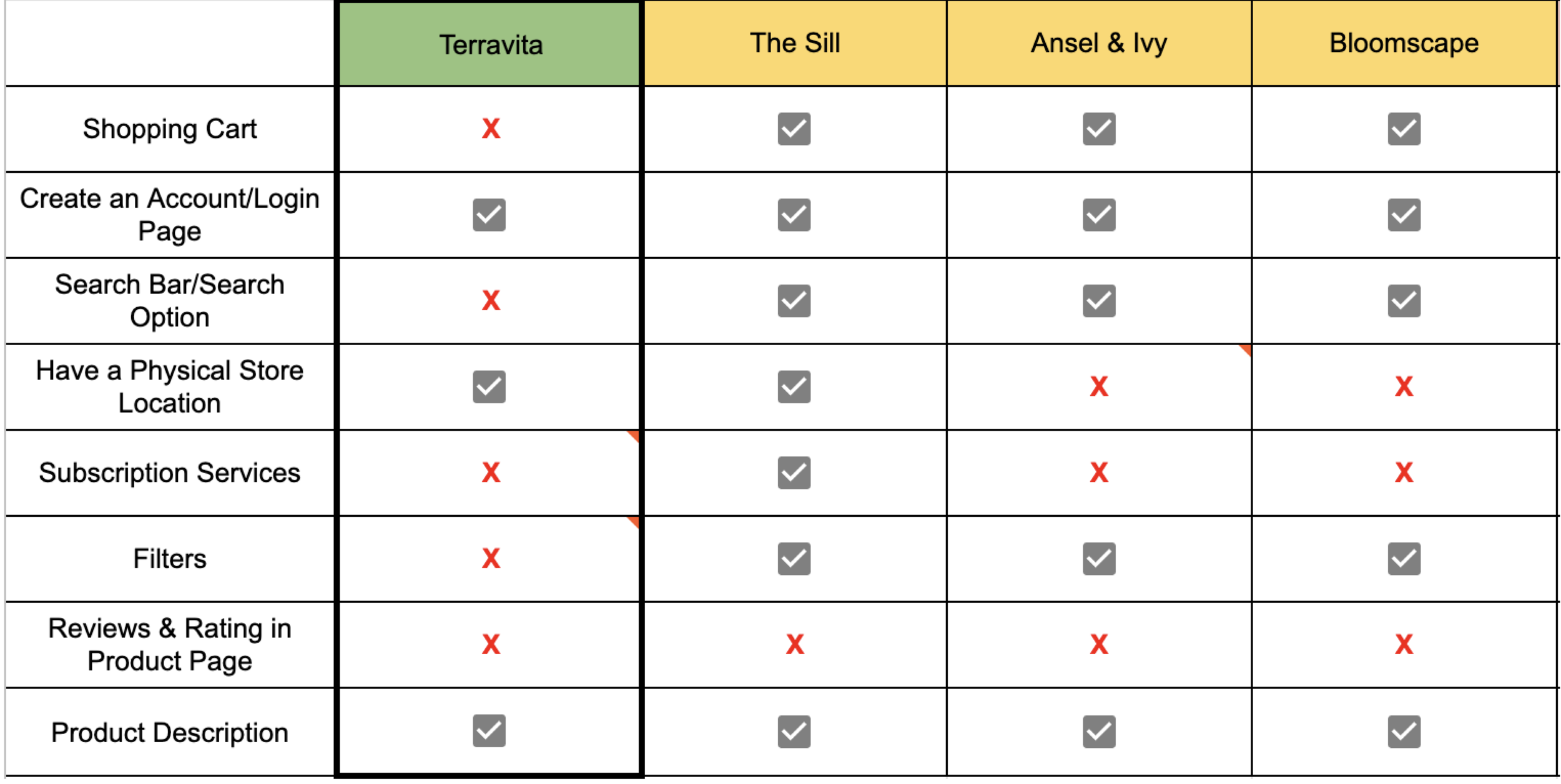
I looked at 3 of Terravita’s direct competitors to compare the features offered on each site. It was very evident that Terravita lacked the basic functions of a website that would create for a seamless e-commerce shopping experience.
Define
Define | Persona
Sophia demonstrates the different behaviors, frustrations, and motivations that plant shoppers would experience when looking to purchase plants; whether that be online or in stores.
Define | User Flow
I created a user flow of the original Terravita website to show the steps a user would take in order to successfully purchase a plant. A major issue in this flow is that the search bar is nonexistent on the site. Without a search bar, users must go through the long way of browsing through categories endlessly in order to find what they need.
Define | User Journey Map
To further understand Sophia’s journey through her online plant shopping experience, I created this user journey map to highlight the emotions that Sophia felt during the process. This was an important step in learning the areas of opportunity.
Define | Site Map
Before I moved onto sketching out solutions, I created a site map for the website to visualize the top navigation. On the original Terravita website, the navigation is a small hamburger menu on the top left side of the page. During one of my first round usability testing, one user had difficulty finding the navigation bar and noted that they did not like the hamburger menu as it was extremely hard to locate and not at all apparent.
In addition to the top navigation, I also rearranged some of the categories for clearer navigation.
Problem Statement:
Plant shoppers need a way to confidently shop for plants online because they worry about the condition of the plants during the shipment process.
How Might We…
… create a solution to help users feel at ease with the shipping process?
… help buyers feel more convinced in their online plant shopping experience?
… make the return policy more clear and informative?
… make the checkout process quicker, easier, and more intuitive?
Design
Design | Sketches
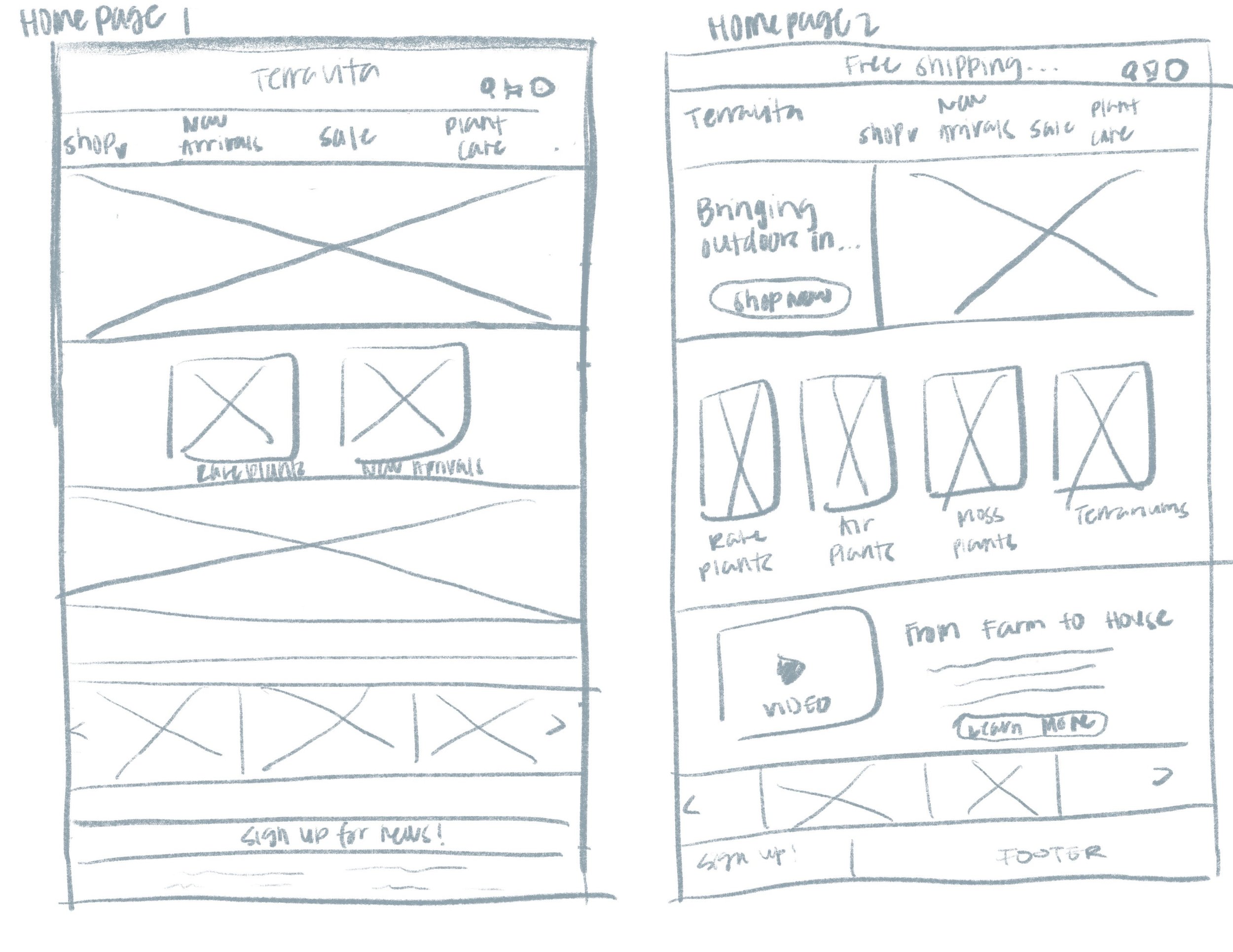
Based on the research I gathered so far, I sketched out multiple solutions for each page of the website. Below are the sketches for the following pages:
home page | category menu | inventory page | product page | reviews section | check out page | about page
Design | Mid-Fidelity Wireframes
From my multiple sketches, I picked out the solutions that would best fit the needs of my users for each page. Below are some of my mid-fidelity wireframes that I turned into a prototype.
Top Navigation Bar
Moved “Free Delivery Over $100” message to the top of the page instead of being at the bottom on the original site
Added a top navigation bar
Added a search icon/bar
Added a shopping cart icon for users to easily view their cart at anytime
Inventory Page
Added filters for easy browsing
Added product name, price, and color availability of planters to the bottom of each product
Product Page
Added breadcrumbs
“Add to Cart” CTA instead of the original “Purchase” CTA
Descriptive details and plant care information
Rating and reviews section
Cart
“Add to Cart” CTA on the product page displays the “My Cart” banner
Design | Usability Test #2
I did my second round of usability test on my mid-fidelity prototype with four users and received the following results below.
Usability Test Results
Task 1
Find the Alocasia Silver Dragon plant and add to cart
All users were able to complete task
Task 2
Go to cart and complete checkout process
All users were able to complete task
All users were able to successfully complete both tasks in under five minutes.
