Project Overview
UX Team
Jenny L. (me)
Irene R.
Catherine G.
My Role
User Research, Screener Survey, Persona, Secondary Research, User Flow, Site Map, Comparative & Competitive Analysis, Service Blueprint, Mood Board, Sketches, Wireframe, Mid-Fidelity Prototype, High-Fidelity Prototype
Tools
Figma, ProCreate, Google Survey, Zoom, Google Slides
Platform
Desktop
Duration
3 Months
What is InkMarket?
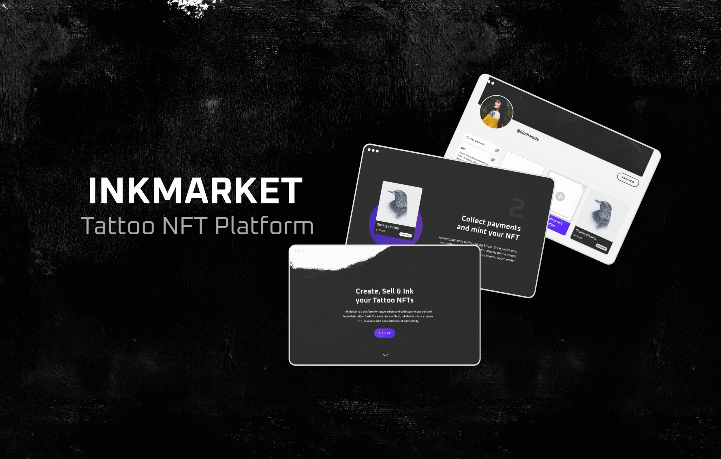
InkMarket is an NFT (Non-Fungible Token) platform for tattoo artists. Tattoo artists design “flash tattoos” without a particular customer in mind. Customers can buy these tattoos, then InkMarket mints the NFTs, making them resellable and tradable. The NFT kind of becomes a “certificate of authenticity” for the tattoo.
The Challenge
-
The Problem
The artists who have already been introduced to the InkMarket platform through personal connections have liked the concept. However, the current website needs improvements in order to provide all relevant information and to effectively explain the concept of NFTs and how the platform works, in a way that allures new artists and instills confidence to display and sell their work through this platform.
-
The Business Goal
Increase conversion rates and get more tattoo artists to sign up on InkMarket’s platform.
-
The Solution
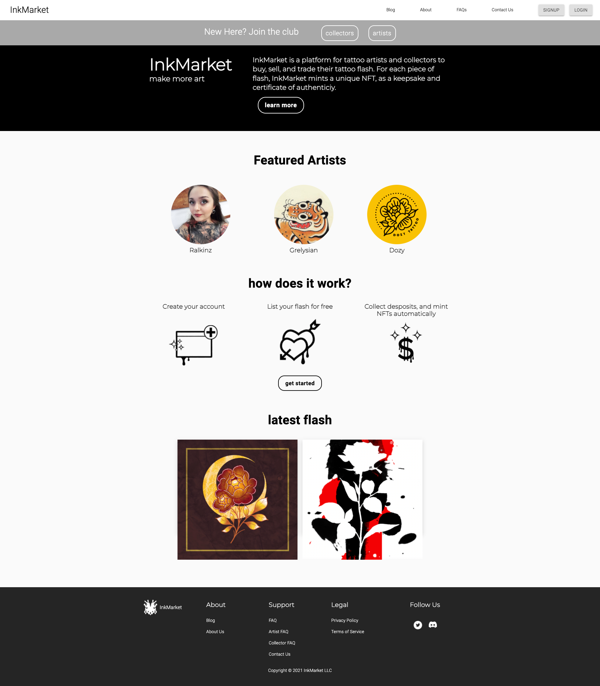
Be transparent about the stage of the company. With this, we decided it was best to create a prelaunch site that will show simplified steps of how the platform works
Rearrange and simplify the artist onboarding sign up process to get users where they need to, faster
Rearrange the content to make the information more digestible
The UX Process
-

Discover
-

Define
-
Design
-

Deliver
Discover
Discover |
Initial Research
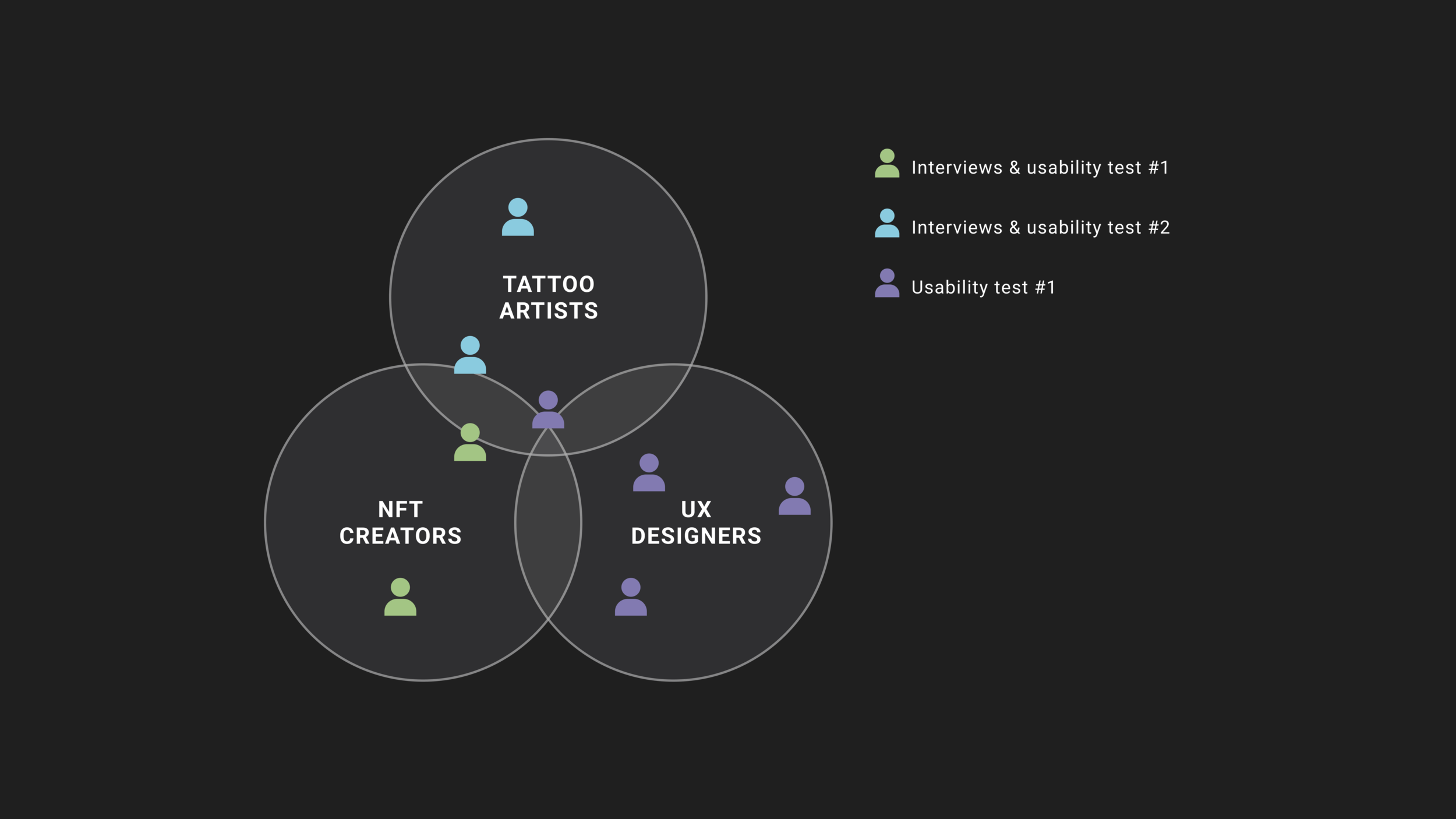
To understand the motivations and frustrations from the different types of users on the InkMarket platform, we began our user interviews and usability testing on the current website. We wanted to interview tattoo artists that had NFT knowledge as well as those without NFT knowledge to identify the user’s main concerns or questions about the concept.
Research Goals:
Discover what questions and concerns people have about NFTs
Learn more about tattoo artists’ motivations and frustrations
Explore what knowledge gap we can fill for non-crypto savvy artists
Evaluate elements and structures of direct and indirect competitors
Research Insights:
Tattoo artists want to expand their market and share their artwork. Lots of artists use their iPads to draw & create flash tattoos nowadays. Often times, many of these digital flashes stay electronically stored and is waiting to be used or to have a purpose.
Copyright & intellectual property concerns - NFTs does some injustice to art because it takes away the showing casing aspect and appreciation value of traditional, tangible art
Mixed feelings and don’t have enough understanding to the realm of NFT to see it’s usefulness
Skeptical whether this business model will succeed
Discover |
Findings & Synthesis:
Our team conducted the first round of usability test on the original InkMarket site to identify potential opportunities, possible pain points, and to get the user’s overall impression of the site.
We assigned two main tasks to the users:
We want you to explore this site and become familiar with the concept of this platform. For the first task, review the Home Page.
What are your impressions of this page? What information were you able to gather that you understood?
After reviewing the home page, what next steps would you take in order to learn more about how this platform works?
Usability Test Result #1:
Plus +
The concept is exciting to the users
They appreciate a clean and straightforward layout with simplified, digestible information
Delta -
The “learn more” CTA should remain within the website
There should be clearer separation of the artist and collector side
Difficult to understand for less tech-savvy individuals
Copyright concerns
Additional Comments
Location is very important to highlight on the interface due to the nature of the tattoo artists’ work
Association of reputable artists will support engagement
Discover | Secondary Research
While my team and I were able to conduct user interview and first round usability testing with two participants, we felt that this was not a sufficient amount of users and information. Due to time constraint, we had to move forward with the project.
In order to further our understanding and knowledge on this topic, we redirected our attention to secondary research. With this, we explored different NFT articles and videos to get a better understanding of the motivations and challenges tattoo artists and those in the NFT community might face.
Discover | Secondary Research Insights
Motivations
Allow to pass down art and stories through generations
“The beauty of the blockchain” - that the art will last forever. Collections of tattoo art will act as a tattoo museum
Portable ownership
Challenges
NFT scams
Define
Define | User Persona
Through the information we gathered from the interviews and usability test, we developed our user persona - Kim Harada. Kim demonstrates the motivations and frustrations tattoo artists experience in their industry.
Define | Service Blueprint
Due to Ink Market’s early stages, our team thought it would be helpful to create a service blueprint to get a better understanding of how the website functions on the front and back end. We met with our client to discuss this information together and discovered some drawbacks to the site that could be improved on.
Problem Statement
-
Tattoo artists need access to new opportunities to expand their business, so that they can create an additional source of income that values their artistic expression as well as their technical abilities
How Might We Statements
-
How might we make the concept and process of being an artist on InkMarket easy enough so that users would trust joining this platform?
-
How might we clearly communicate the value of NFTs and how it can benefit the tattoo artists business?
-
How might we develop a sense of belonging, inclusiveness, and ensure integrity in this new digital community?
-
How might we address their needs as service providers and help artists guide their clients to buy their work in a new format?
Design
Design | Initial Sketches
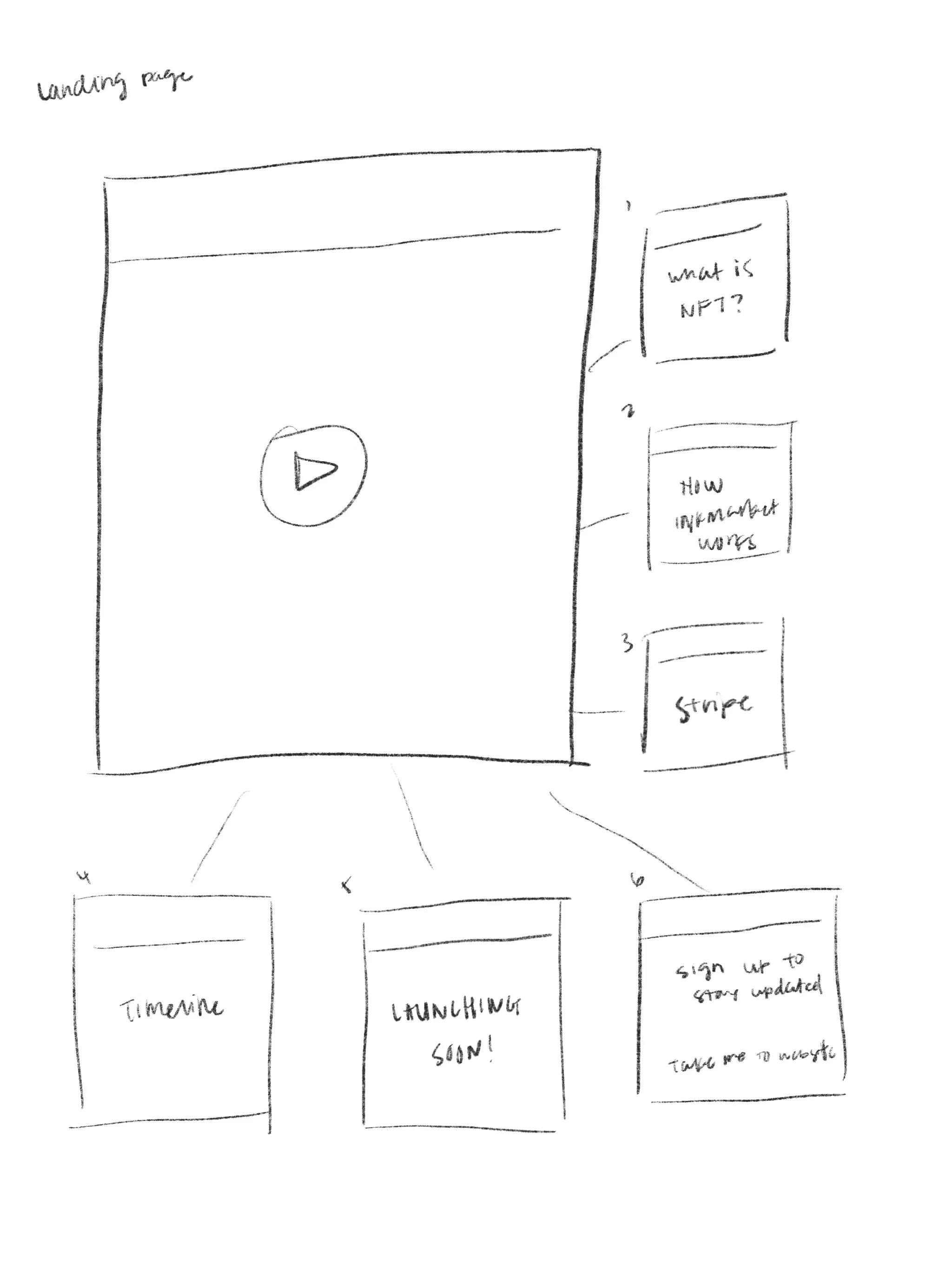
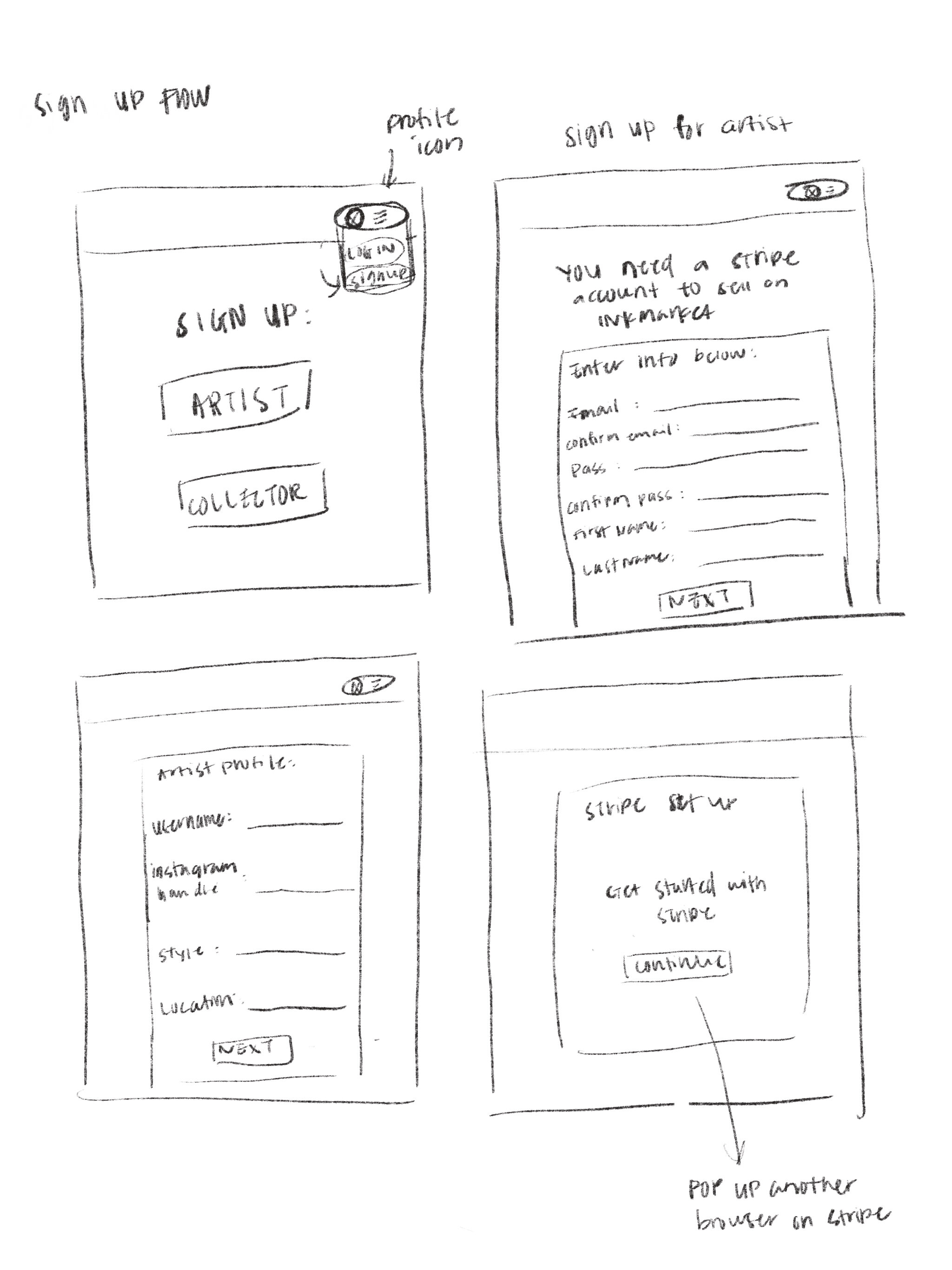
With all the information we gathered and received from our discover and defined phase, we moved onto individually sketching out multiple design solutions that would ultimately help InkMarket’s conversion rate go up.
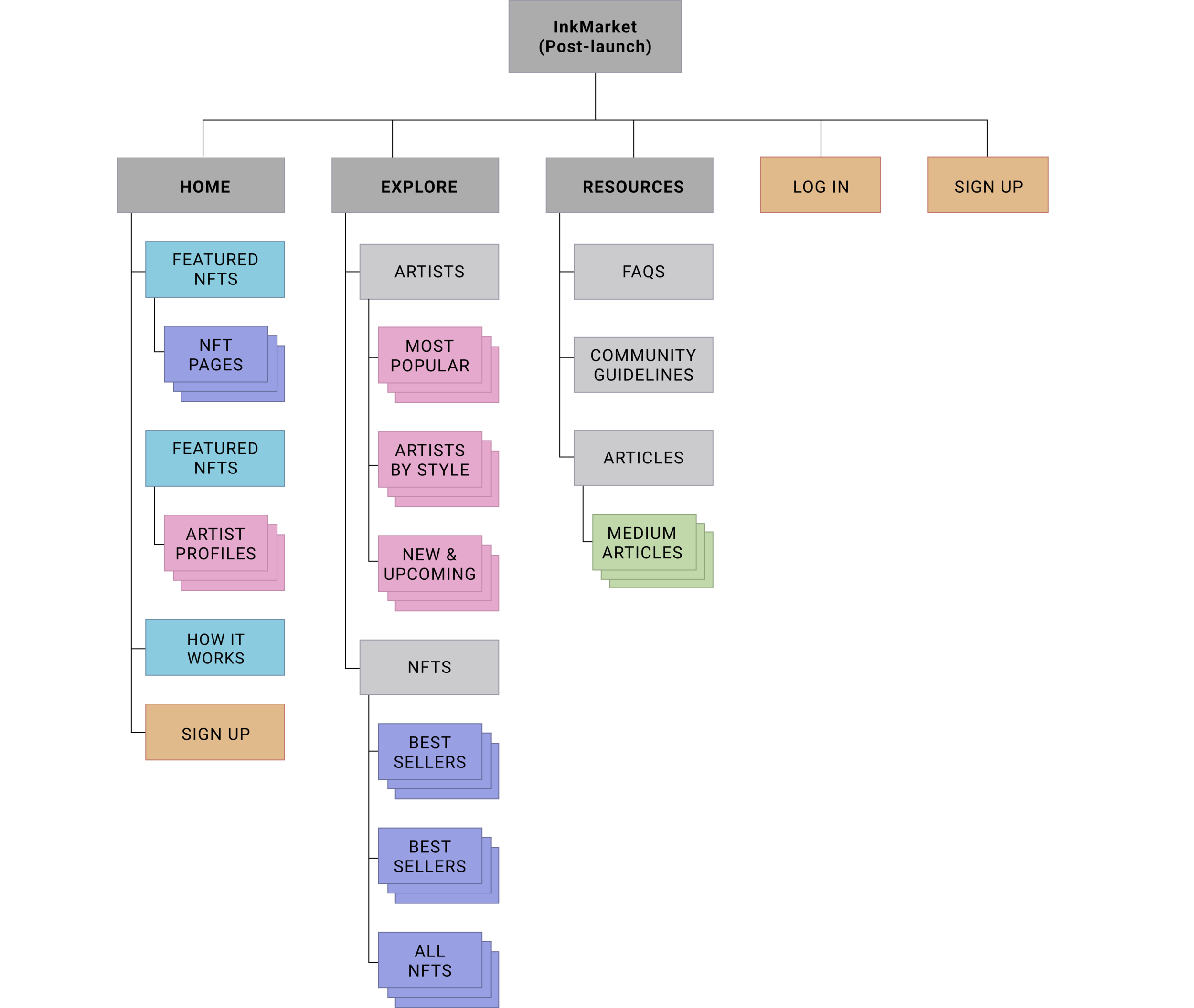
Our team did two rounds of sketching. We decided that the MVP should be focused on the landing page/home page, the artist sign up flow, the artist profile page, the about us page and the FAQ page; so these were the pages we sketched out and explored.
After reviewing and discussing the sketches, we combined some of the designs ideas and did our second round of sketching.
Design | Mood Board
After sketching and having an idea of how the skeleton of the site will be like, we moved onto the visual aspects of designing the site. My team and I each created our own mood boards to draw inspiration on how we wanted the site to visually appear. Our client had specific branding requirements in which they wanted to keep the site on a black and white, grayscale theme in order to enhance the flash tattoos that are uploaded on the site and they wanted their logo to have some type of drip design to exhibit the idea of inks dripping.
When I created my mood board, I kept that information in mind and gathered inspiration for different shades of black, white, and gray colors on different textures and typography as well as looked at how some NFT sites are designed.
Design | Feature Prioritization
InkMarket is a very new site and idea that is still in their early stages. Due to this, the site had minimal content to work with and needed readjustments on some areas in order to create a more pleasant user experience. Our team decided on using the feature prioritization technique to determine what we needed to focus on given the lack of content, as well as limited time.
1
Redesign the Home Page to display a pre-launch site
2
Redesign & reorganize the artist Sign-Up flow
3
Apply UI and Visual Design principles
Design Solution #1 |
Redesign Home Page for Pre-Launch Phase
With InkMarket in their very early stages, the creators of the site are still planning and developing out all of its functions. While they are doing this, the current website is actually “live” and functioning to the public. Our team saw issues with this because there were still a lot of unclear areas and questions that left users confused and unconvinced when using the site.
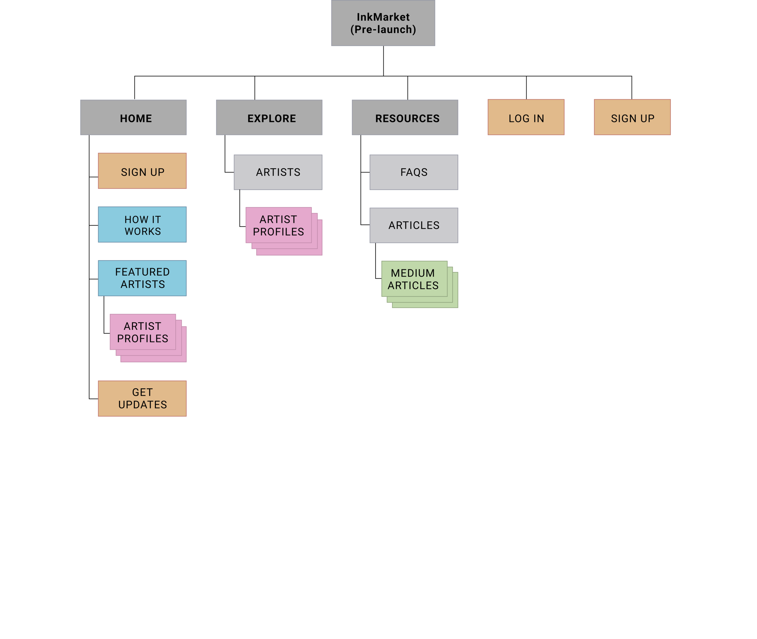
After looking at other competitive sites, our team thought it would be best to create a home page that would reflect a pre-launch phase of the company to be completely transparent to its users and to clearly communicate the future roadmap of InkMarket.
Competitive Analysis
Most of InkMarket’s direct competitors are still in the pre-launched phase with minimal information displayed. Some of these information include how the site works, or its key benefits.
While Ethernaal is still in their pre-launched phase, the site actually has a lot of information displayed. This includes: roadmap & countdowns, how many members they have across different cities/countries, who their team members are, and who they are partnered with. All of these are informational details to give transparency to the stage of the company and how it operates to users visiting their page.
An edge that InkMarket has over its competitions is the featured artists section on the home page. One of the users in our first usability test noted that this would be an area they’d explore first to find out more about the site.
Direct Competitor - Ethernaal
Key Insights about Ethernaal:
To create the NFTs, Ethernaal came up with 6 different categories with 26-28 classifications for the minting contract to function as they expect. Essentially this is like a catalog of projects with guidelines & terms to follow to streamline their NFT process. This shows the company put thought into the different scenarios that would come up and how they would tackle those situations to smoothly run the company.
Recruited big name tattoo artists from around the world. Very selective process to filter unique artists to join their platform as they wanted artists that will be dedicated to Ethernaal.
Hired a trainer to specifically focus on onboarding the first 50 artists and created a training program to initiate the artists on how to use Ethernaal’s platform.
This approach creates a sense of community and transparency for these artists who will be dedicating their time to the company.
Design | Site Maps
Design Solution #2 |
Redesign the User Sign Up Process
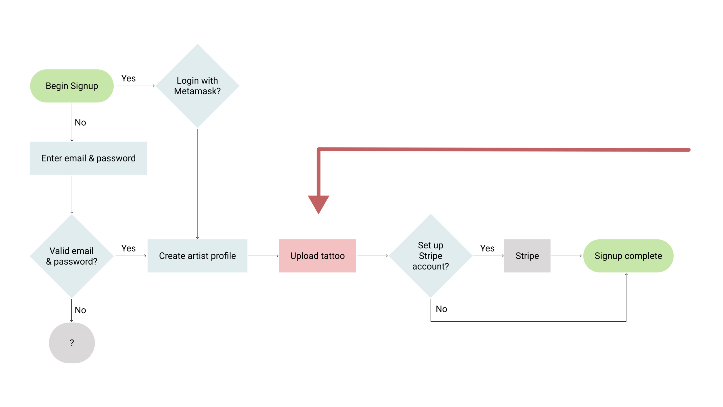
Our team found the current InkMarket artist sign up process to be quite extensive. To create for a better onboarding experience, our team thought it would be best to redesign this process in order to minimize effort for new users to join InkMarket’s community.
InkMarket Onboarding Flow
In InkMarket’s current sign up flow, the third step is asking for artists to upload their flash tattoo artwork. Our team thought this was a lot to ask new users who are onboarding to do as the process is quite extensive; it requires picking a piece to upload, setting the price, and adding in description when users don’t really have a clear understanding of how the platform will look like or how it will perform. This step is required for users to complete in order to get to the artist profile page as there is no way to allow the users to hit “skip”.
Often times, people just want to get to their profile or end goal as quickly as possible to explore and see if this will be a platform they’d continue to use.
Indirect Competitor | IYNK
IYNK has a sign up flow where steps are short with minimal information required to create the artist profile page. Through secondary research, we found that among the best practices for the onboarding process is to reduce the requirements that are asked so that users can get to where they need to as quickly as possible.
User Flow | Artist Sign Up Process
Design Solution #3 |
Applying UI and Visual Design Principles
For the last solution, our team analyzed and rearranged the content by applying the following UI & visual design principles:
Legibility
Spacing and alignment
Line Length
Consistency
Contrast
Style Guide | Typography
We went with 3 font choices to create consistency in the way the texts were presented on the site.
Oxanium for Headers
Montserrat for Buttons
Roboto for Body text
Style Guide | Color Scheme
Kept majority of the site in grayscale as requested by client, but we wanted to introduce a color to break up some of the content. Based on some indirect competitors that we looked at, purple seem to be a popular choice of color within the Crypto and NFT sites.
Style Guide | UI Components
Purple is mainly added onto the CTA buttons and certain toggle buttons
The buttons include different gradients to show their active, inactive, and hover states
Deliver
Deliver | Usability Test #2
We conducted our 2nd round of usability testing on our mid-fidelity prototype with 6 different users in which we assigned each with four tasks.
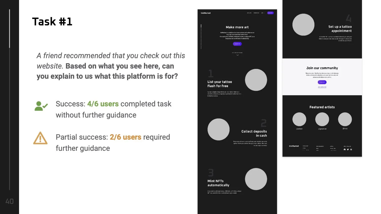
Task 1: A friend recommended that you check out this website. Based on what you see here, can you explain to us what this platform is for?
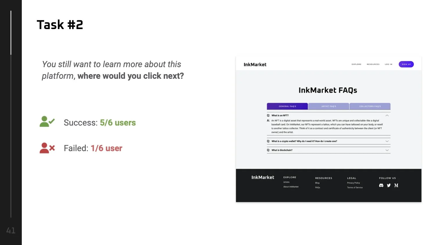
Task 2: You still want to learn more about this platform, where would you click next?
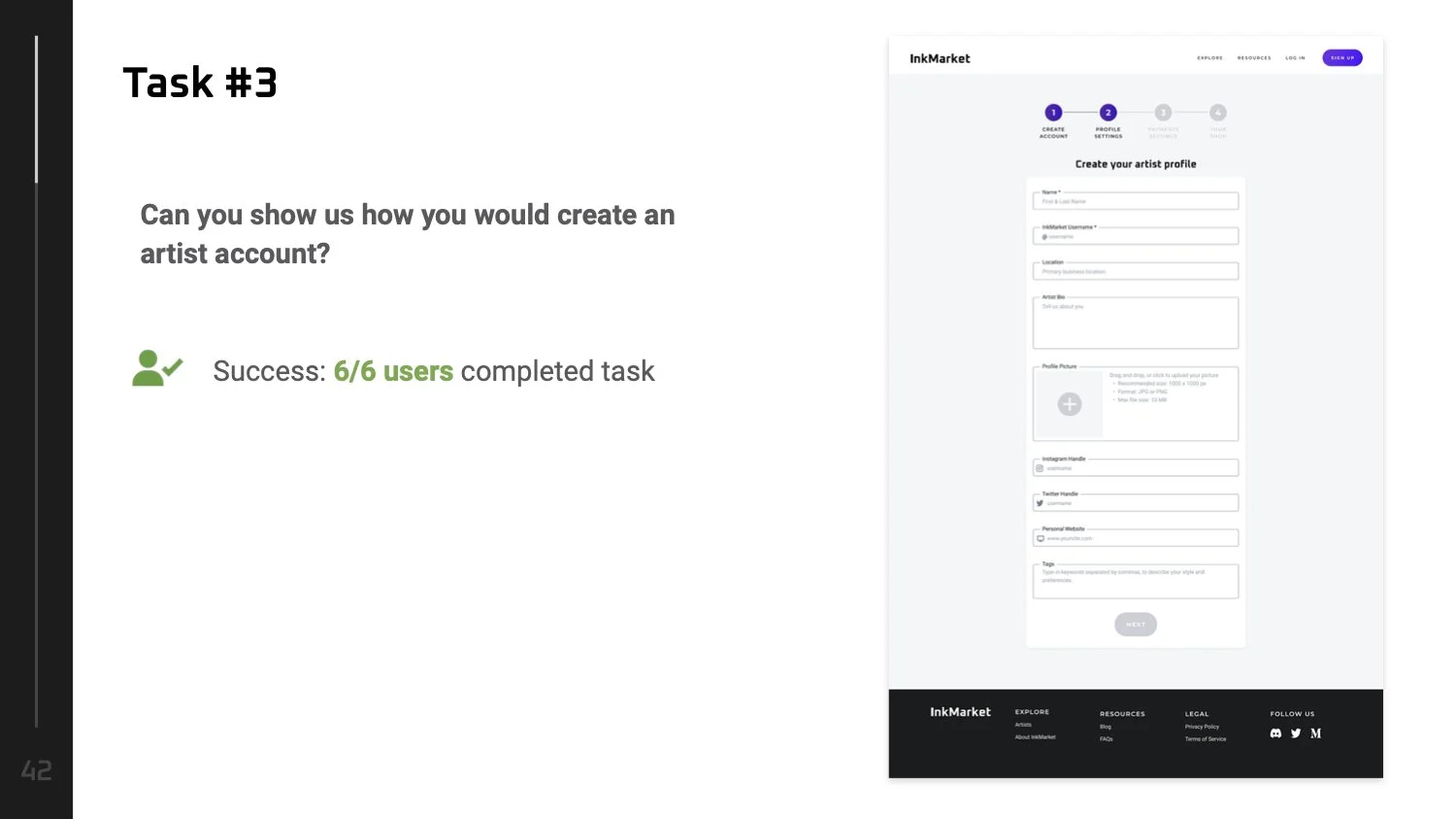
Task 3: Can you show us how you would create an artist account?
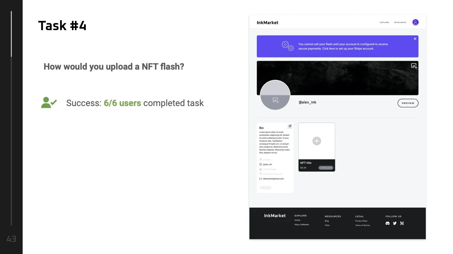
Task 4: How would you upload a NFT flash?
Deliver | Usability Test #2 Results
Deliver | Design Iterations
Aside from the usability testing tasks, we also asked our users some follow up questions after the test was completed. Based on their feedbacks, it gave us a clear understanding of what needed to be modified.
Deliver | Iteration #1
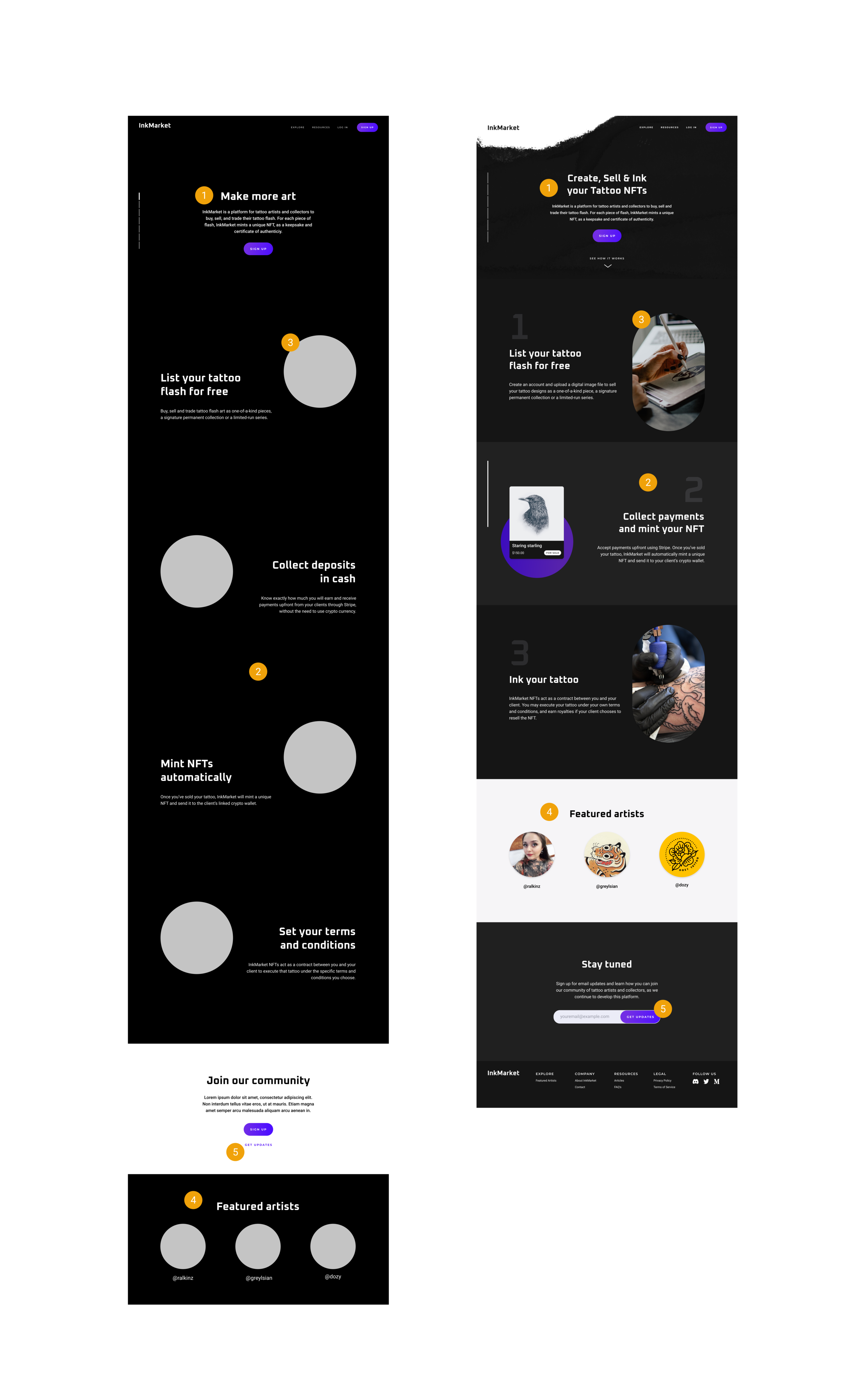
Home Page
Changed headline to communicate the idea of InkMarket at first glance
Merged steps 2 and 3 to reduce the length of scroll
Added visual elements that would keep user’s interest while scrolling
Moved featured artists up
Changed second CTA to get email updates
Deliver | Iteration #2
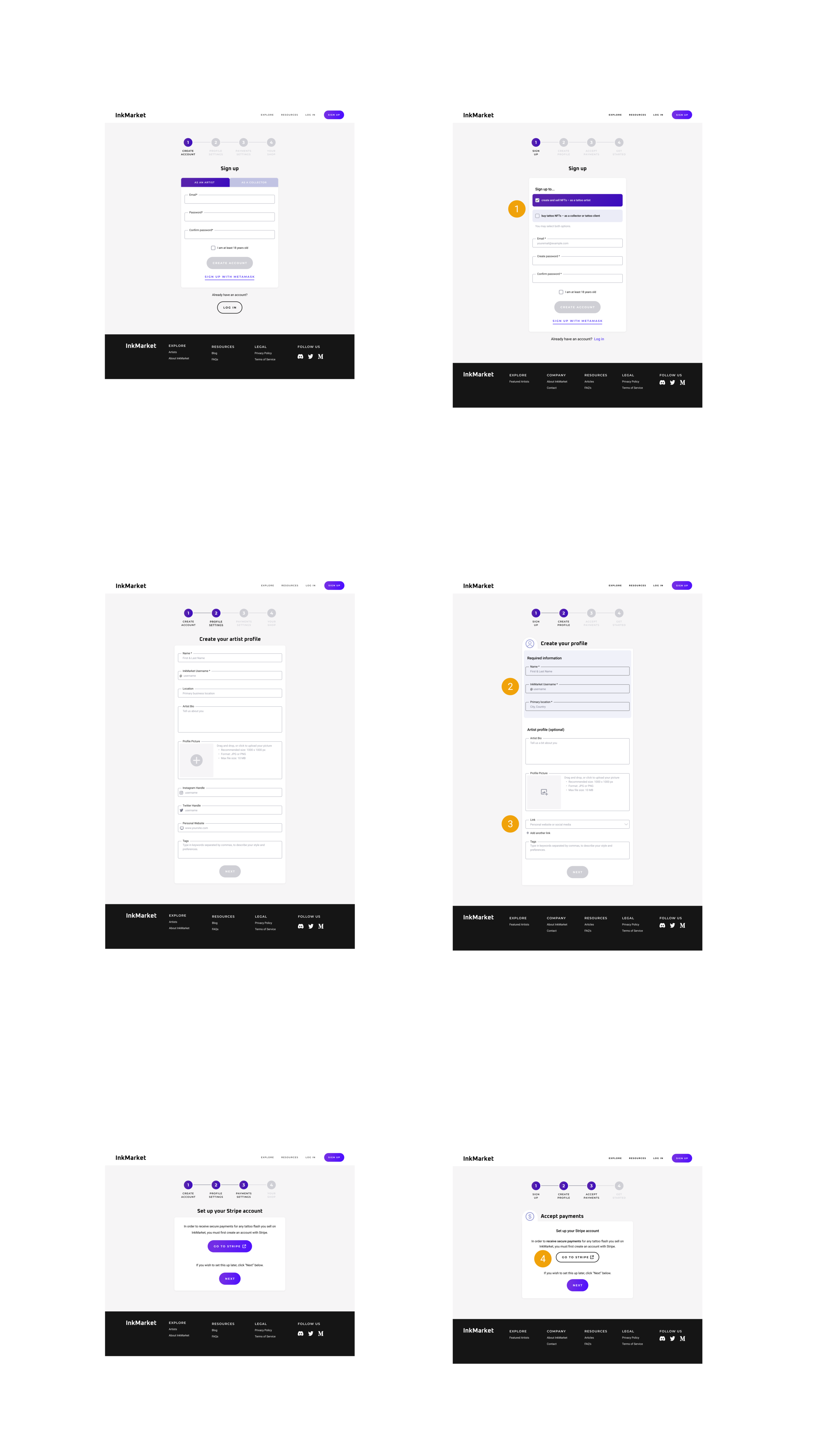
Sign up Process
Clarified the purpose of signing up and allowed users to check both options (to sign up as a tattoo artist and/or to sign up as a collector)
Highlighted required fields, including location
Gave users the the option to add more links and other social media handles
Changed the CTA button “Go to Stripe” to a neutral color so that both CTAs are no longer competing each other and to make it more obvious for users they have the option to skip ahead by clicking “next”
Deliver | Iteration #3
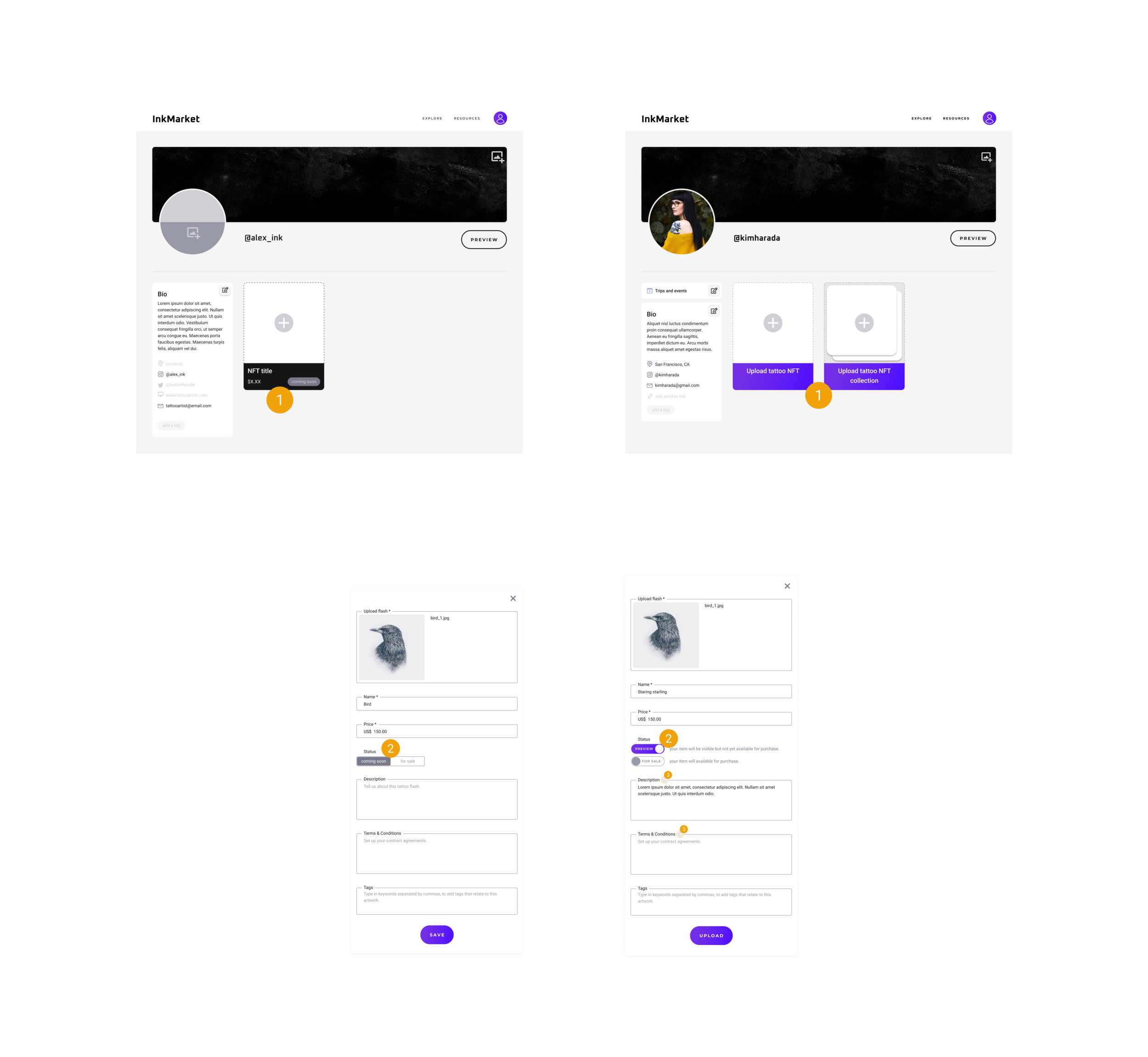
Tattoo Flash Upload
Made the upload flash box more visible and added new features (i.e., option to create a collection)
Added clarification/description text next to “status” section as there were confusion on what this meant
Added info button for guidance next to description + terms & conditions box
Deliver | Iteration #4
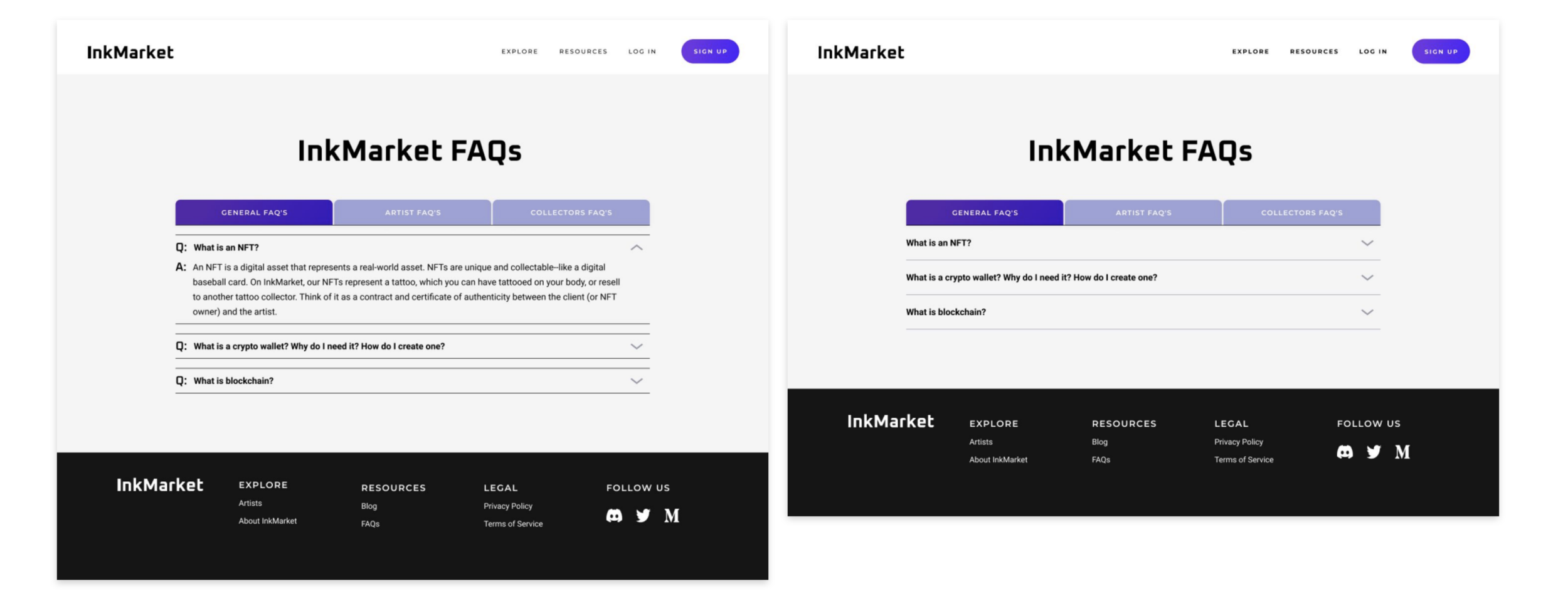
FAQs
Simplified the layout on the FAQ page to make it easier for users to scan and read text.
Deliver | Hi-Fidelity Prototype
For our Client | Insights & Next Steps
“If you want people to join it needs to be crystal clear how this works and what they’re getting from it”
Clarify and Transparency
Bringing out some elements into the interface itself
Implementing crypto-currency or communicating rationale behind decisions
Considering announcing launch dates or roadmaps
Introducing the concept with mockups or explainer videos
Community Building
Offering training efficiently (materials, webinars)
Building hype on social media
Think about a special benefit or perk to join
Reaching out to "big names" in the industry
